Quantified self always came with the same toll: the spreadsheet. To track weight, runs, mood or sleep you had to build a table, remember to fill it in, and maintain it forever. Most people quit by week two.
CleverNote takes that toll off the road. You jot a number your own way, in the language you already use, and the rest happens on its own.
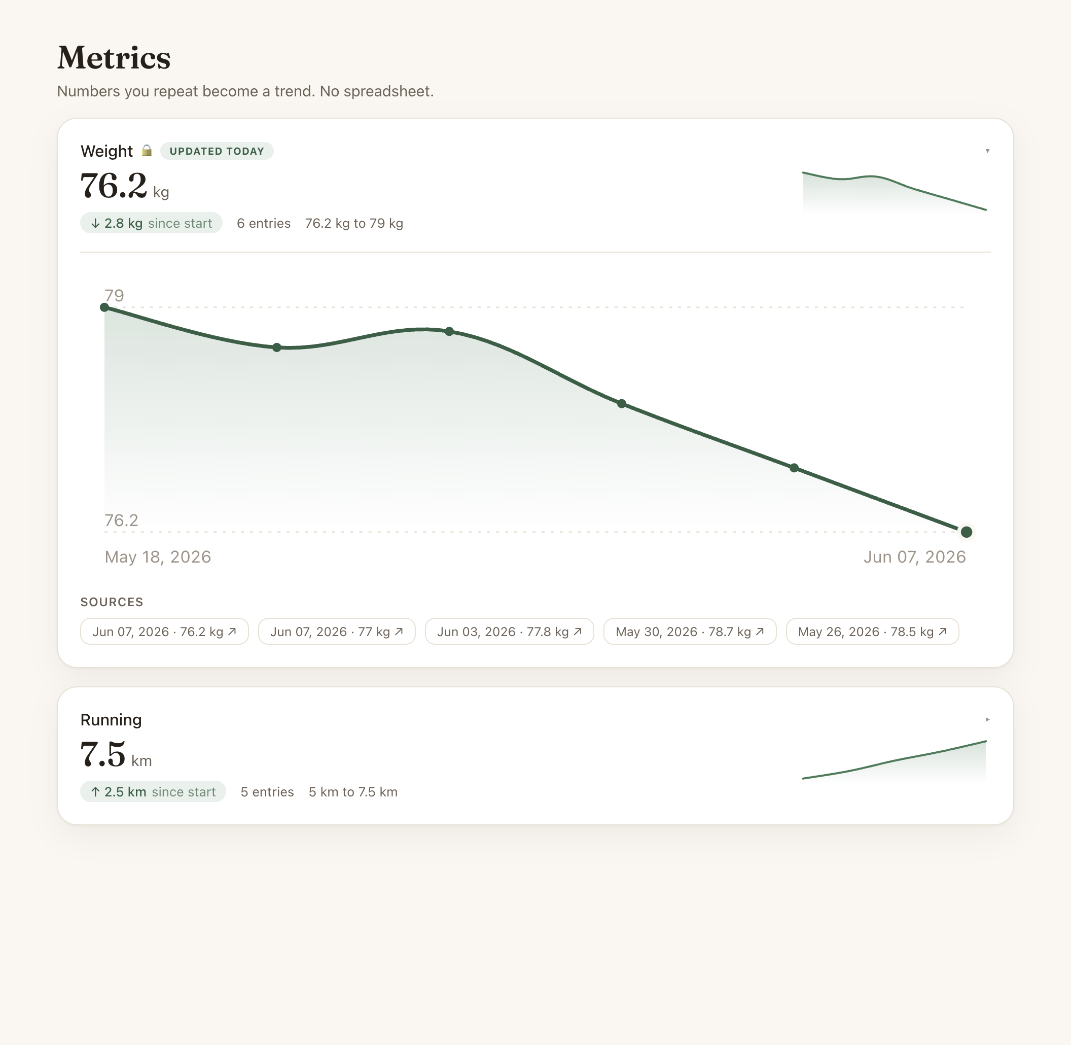
You write a sentence, it builds the time series
“weighed 76.2 today.” “ran 7.5 km.” “slept 6h.” “mood 7/10.” Normal sentences, the way you’d text a friend. CleverNote reads it, understands there’s a self-measurement in there, and stores the number with its date.
From the third time the same quantity shows up, it becomes a time series: a sequence of points over time. And the trend chart appears, automatically. No creating a spreadsheet, naming a column, picking an axis. You just lived your life and jotted it down; the curve is a consequence.
CleverNote decides what’s a metric and what isn’t. A number that’s money (“spent 50 at the market”) goes to Finances, not here. A number that’s a measurement of yours that tends to repeat (“blood pressure 120 over 80”) becomes a series. You don’t configure that boundary: it’s understood, not programmed.
And now the curve has the look it deserves
Detecting the series was half of it. The other half is you glancing at it and getting it instantly. We just rebuilt that whole part.
Every metric became a living card. Up top, the most recent value, large. Right below it, how much you’ve moved since the start (an arrow with the difference), how many entries you have, and the range between the lowest and highest. Off to the side, a mini curve you read without even clicking.
Open the card and the full chart comes up: a smooth line with a filled area, reference lines for the min and max, the most recent point highlighted, and each point’s value on hover. Below it, the notes that produced each entry, clickable. Because in CleverNote every number has a source: the curve isn’t a loose data point, it’s your own memory, traceable back to the sentence you wrote.
A nudge when a trend is born
You don’t have to go hunting for your metrics. When a quantity crosses the third entry and becomes a trend, CleverNote tells you: “new trend.” Your home panel has a “Your trends” card with your most recent curves, and the nudge carries a direct shortcut: “view the curve.” One tap and you’re looking at the chart.
It’s the whole CleverNote philosophy in one feature: you capture loosely, your own way, and your memory stitches it together, organizes it, and shows you at the right moment, without becoming one more thing to manage.
Fixable in one sentence, like everything here
Got a number wrong? “that weight was 76, not 67” fixes it. Want to delete an entry, change the unit? One sentence does it. Your corrections always beat CleverNote’s guess, and they teach the system to make fewer mistakes with you.
Jot your first number today. Three from now you’ll have a curve.
Frequently asked questions
- How does CleverNote know a number is a metric?
- CleverNote judges on its own whether a number is a self-measurement you tend to repeat (weight, runs, mood, sleep, blood pressure, glucose). A number that is money still goes to Finances. You configure nothing and don't change how you write.
- How many entries until it becomes a chart?
- Three of the same quantity. From the 3rd point the series shows up as a curve. That cutoff keeps a one-off number from becoming noise, and it's when the trend starts to make visual sense.
- Do I have to log it the same way every time?
- No. 'weighed 76.2', 'weight 76.2 kg', 'I'm at 76 kilos' all land in the same series. CleverNote normalizes the quantity, so the curve doesn't fragment because of how you phrased it.
- Who sees my health metrics?
- Only you. Weight, blood pressure, glucose and mood are flagged as sensitive and follow the same governance as the rest of your memory: exportable, deletable and isolated per account. No local model, no training on your data.
Ready to try? CleverNote is free to start, no credit card required.
Try for free